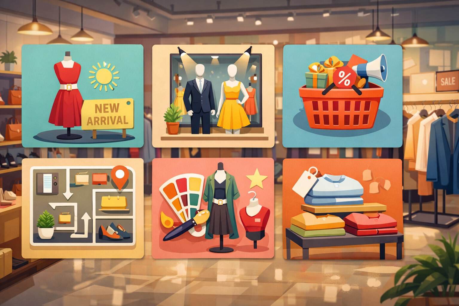
Visual Merchandising Tips for Retailers
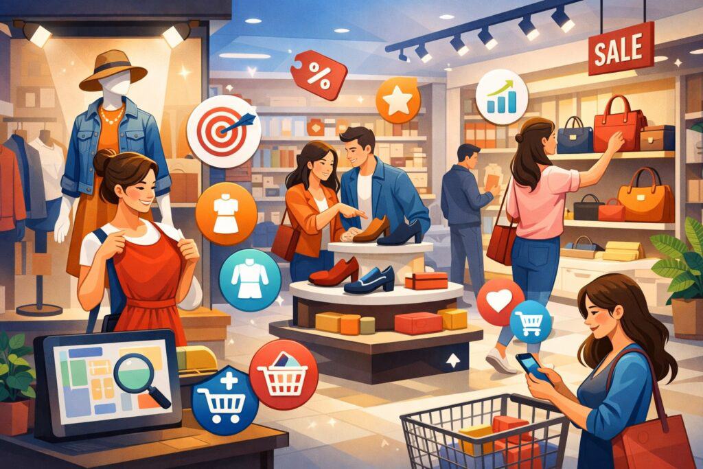
Visual merchandising is the silent sales associate that shapes how shoppers feel, move, and buy. In a world where attention is expensive and choices are endless, strong in-store presentation helps retailers turn “just browsing” into confident purchases.
When done well, visual merchandising makes products easier to find, easier to compare, and easier to imagine in real life. It also protects margins by reducing reliance on constant discounts, because shoppers are more willing to pay when the experience feels curated and trustworthy.
The most effective retail merchandising strategies focus on three outcomes: clarity, desire, and momentum. Clarity means shoppers instantly understand what you sell, where to go, and what to do next. Desire comes from displays that trigger emotion—aspiration, comfort, excitement, or relief—depending on your category.
Momentum keeps shoppers moving smoothly from discovery to decision. Modern visual merchandising also plays a role in brand consistency. Shoppers now expect physical stores, websites, and social content to feel connected, and store visuals are often what make that connection feel real.
This guide shares practical strategies retailers can apply in boutiques, specialty stores, and multi-location environments. You’ll learn how to plan displays, improve store layout, use lighting and signage, train staff, measure results, and prepare for evolving merchandising trends.
Build a Visual Merchandising Strategy That Matches How People Shop
Visual merchandising starts long before you place a product on a shelf. It begins with decisions about what you want shoppers to notice first, what story you want the store to tell, and what actions you want visitors to take.
A strong visual merchandising strategy aligns product priorities with shopper psychology. People scan fast, make snap judgments, and rely on visual shortcuts. Visual merchandising organizes those shortcuts so customers feel confident instead of overwhelmed.
Start by defining your “hero categories.” These are the departments or products that drive the most revenue, profit, or brand identity. Visual merchandising should protect hero categories with the best real estate: front-of-store, power walls, endcaps, and focal displays.
Next, identify your “support categories” that increase basket size. Visual merchandising should place those items near heroes to encourage add-ons. For example, if your hero is premium denim, support categories might be belts, care kits, and accessories displayed as a complete look.
Your visual merchandising strategy should also include brand standards. Choose consistent rules for color blocking, signage style, fixture types, and product density. Shoppers don’t need perfection, but they do need consistency. Consistency makes your store feel legitimate and makes decisions feel easier.
Finally, build a seasonal plan. Visual merchandising works best when it changes often enough to stay fresh, but not so often that execution becomes chaotic. Many retailers aim for “mini refreshes” weekly and “story resets” monthly.
Use the Decompression Zone and Customer Journey to Control Store Flow
The first 5–15 feet inside your entrance is the decompression zone. Shoppers are adjusting to lighting, temperature, sound, and spatial layout.
If this area feels cluttered or aggressive, it creates stress. Instead, the entry should feel open, calm, and directional.
Communicate one clear message near the entrance—such as new arrivals, a seasonal highlight, or a single curated display. Avoid overwhelming shoppers with too many options right away, especially if discounting is not central to your brand.
Beyond the entry, guide movement using focal points, lighting, and natural pathways. Feature walls can pull customers deeper into the space, while floor fixtures create pauses and gentle turns.
Different shoppers have different goals. Some want speed, others want inspiration. Clear best-seller zones support efficiency, while curated displays encourage exploration. When store flow mirrors shopper intent, conversion improves naturally.
Create a Store Layout That Supports Visual Merchandising and Sales Goals
Store layout is the skeleton; visual merchandising is the muscle. If your layout fights customer behavior, even the best visual merchandising won’t perform. Start with the basics: sightlines, aisle width, and category logic.
When shoppers stand at the entrance or at key intersections, they should immediately see something attractive and relevant. Visual merchandising relies on these “moments of truth” where people decide whether to keep exploring.
Choose a layout style that matches your product and shopper behavior. A racetrack layout (a main loop) is common in larger stores and helps guide traffic. A free-flow layout supports browsing and discovery, often used in boutique retail.
A grid layout is efficient and works well for convenience-driven shopping. No layout is automatically better—visual merchandising simply needs consistency and clear wayfinding.
Planograms are valuable visual merchandising tools even for smaller retailers. You don’t need complex software to benefit. A simple planogram can define how many facings each product gets, what height each category lives at, and what items get premium placement.
Eye-level placement is high value, but don’t ignore hand-level and “reach zones.” Also, think vertically. Many stores underuse vertical merchandising. Tall displays, stacked shelving, and vertical color blocking can increase perceived assortment without increasing clutter.
Finally, protect space for focal displays. Visual merchandising needs breathing room to tell stories. If every square foot is packed, nothing stands out. Build intentional negative space so hero products and promotional stories can “pop.” This is especially important when you want to sell higher-ticket items that need a premium feel.
Master Product Placement, Planograms, and High-Impact Retail Zones
Certain zones consistently outperform others, and visual merchandising should prioritize them. These include power walls, endcaps, checkout areas, and transition zones (where shoppers move between departments).
Power walls are high-visibility vertical displays, often positioned to the right after entry because many shoppers naturally drift that direction. Endcaps capture attention because they face traffic. Checkout zones convert waiting time into add-on purchases.
Use visual merchandising rules of thumb to guide placement. Best sellers belong where they are easy to shop and easy to replenish. High-margin items belong where attention is naturally high.
New arrivals belong where they signal freshness—near entry, on focal tables, or on a dedicated “new” wall. Clearance belongs where it doesn’t damage brand perception, unless discounts are central to your positioning.
Planograms make visual merchandising repeatable. They also help train staff and maintain standards. Define product groupings based on how shoppers think, not how your inventory system thinks.
For example, shoppers may prefer “workwear essentials” rather than separate sections for shirts, pants, and outerwear. Visual merchandising that mirrors the shopper’s mental model reduces confusion and increases basket size.
Also watch shelf height and product density. Overcrowded shelves reduce perceived value and make shoppers hesitant. Understocked shelves can look picked over. The goal is a “full but not stuffed” look.
Use risers, trays, and product stands to create levels. Visual merchandising thrives on height variation, which makes displays feel dynamic and intentional.
Design Window Displays That Stop Traffic and Tell a Clear Story
Window displays are visual merchandising at its most powerful because they work before someone even steps inside. A strong window display acts like a billboard, a brand statement, and a product pitch all at once. The best visual merchandising tips for retailers often start here because windows can increase foot traffic without additional advertising spend.
Start by choosing one story per window. One story might be seasonal (“Summer travel essentials”), problem-solution (“Organize your home in minutes”), lifestyle (“Weekend comfort”), or trend-forward (“New textures and color”).
Visual merchandising fails when windows try to show everything. Shoppers can’t decode clutter from a sidewalk. They need one idea, one focal point, and one reason to enter.
Use a focal triangle. Place the main product or mannequin at the center, then support it with secondary products that reinforce the story. Lighting is essential even in daylight.
Add directional lighting to highlight the hero item and create depth. Props can help storytelling, but only if they support the product. A window display is not a theater set—it’s visual merchandising designed to sell.
Refresh windows regularly. Even a small update—new signage, different color story, or a swapped hero product—signals that your store is active and current.
If you have limited resources, build a “window kit” system: a set of reusable props and fixtures you can rotate with minimal effort. Consistent window visual merchandising builds brand recognition and makes your storefront feel worth visiting again.
Build In-Store Displays That Increase Basket Size Through Cross-Merchandising
In-store displays are where visual merchandising turns browsing into buying. The goal isn’t just to make the store look pretty—it’s to help shoppers build solutions.
That’s why cross-merchandising is one of the strongest visual merchandising tactics. Cross-merchandising places complementary items together to increase average transaction value and reduce the effort required to build a bundle.
Start with vignettes. A vignette is a small, lifestyle-style setup that shows products in context. For apparel, this might be a complete outfit with accessories. For home goods, it might be a tabletop scene or a “small space” setup.
For specialty retail, it might be a “starter kit” bundle. Visual merchandising vignettes work because they answer the shopper’s silent question: “How do I use this?” or “What goes with this?”
Use display rhythm. Alternate between dense product zones and open storytelling zones. Too much storytelling without shopability frustrates customers. Too much product density without storytelling feels like a warehouse.
Visual merchandising should balance inspiration and efficiency. Add signage that clarifies the display’s purpose: “Complete the look,” “Build your kit,” or “Best sellers for busy mornings.”
Also use impulse displays strategically. Place small, high-utility items at checkout, near fitting rooms, and at queue points. The best visual merchandising impulse zones offer products that solve last-minute needs, not random leftovers.
Think travel-size, accessories, care items, and small gifts. When cross-merchandising is done with intention, visual merchandising becomes a basket-building engine instead of just decoration.
Use Lighting, Color, and Fixtures to Make Visual Merchandising Feel Premium
Lighting is one of the most influential visual merchandising tools because it controls mood and attention. Poor lighting makes even great products look low-value. Strong lighting makes displays feel intentional, clean, and premium.
A practical approach is layered lighting: ambient lighting for general visibility, accent lighting for focal displays, and task lighting where shoppers need clarity (like fitting rooms or checkout).
Upgrade where it matters most. If you can’t overhaul your entire store, improve visual merchandising by adding accent lighting to your power wall, feature tables, and window displays. Track lighting, adjustable spotlights, and well-placed LEDs can dramatically improve product presentation.
Also pay attention to color temperature. Warm light can feel cozy and upscale, but may distort true product color. Neutral light often supports clarity and trust, especially for beauty, apparel, and any color-sensitive products.
Color is a core visual merchandising language. Use color blocking to simplify choice and make walls feel organized. Use a limited palette for focal displays so the hero product stands out.
Contrast is your friend—light items on dark backdrops, or bold items against neutral fixtures. Avoid mixing too many competing colors in one display unless “maximalism” is part of your brand identity.
Fixtures matter too. A flimsy rack makes products feel cheap. A clean fixture with consistent spacing makes products feel curated. Visual merchandising is about perception. Even simple improvements—matching hangers, aligned tags, consistent folding, and clean shelves—raise perceived value.
Choose fixtures that support your category: slatwall for flexibility, gondolas for high-capacity retail, tables for folded goods, and wall bays for vertical merchandising. The right fixture strategy makes visual merchandising easier to maintain and easier to scale.
Improve Signage and Price Presentation to Reduce Confusion and Increase Trust
Signage is visual merchandising that speaks. It guides, explains, and reassures. The best signage reduces friction: where to go, what’s new, what’s on promotion, and why a product is worth the price. When signage is unclear, shoppers hesitate. When signage is clear, shoppers move forward.
Use a signage hierarchy. First is wayfinding: category signs that help shoppers navigate. Second is promotional messaging: limited-time offers, bundles, or seasonal stories.
Third is educational signage: features, benefits, comparisons, and “how to choose” guidance. Visual merchandising works best when signage is consistent in font, tone, and placement.
Price presentation is also part of visual merchandising. Shoppers want to know what something costs without feeling embarrassed to ask. Make prices visible, readable, and accurate. Inconsistent pricing breaks trust and can cause walkouts.
If you run promotions, ensure the offer is easy to understand. Avoid complicated conditions in large print. If conditions are necessary, summarize them clearly and provide details in smaller text.
Use benefit-focused messaging where it matters. For higher-ticket items, add short “why it’s worth it” cues. For technical products, add comparison charts in simple language (without overwhelming shoppers).
For giftable categories, add “perfect for” prompts. Visual merchandising signage should feel helpful, not pushy. Helpful signage makes your staff’s job easier because it answers common questions and supports confident decisions.
Finally, keep signage tidy. Curling corners, faded prints, and mismatched signs make the store feel neglected. Visual merchandising depends on polish. Small details create big perception shifts, and signage is one of the fastest ways to raise your store’s credibility.
Connect In-Store Visual Merchandising With Digital Shopping Behaviors
Modern shoppers blend physical and digital behavior without thinking about it. They may discover a product online, inspect it in person, then buy later. Or they may see it in the store and compare reviews on their phone. Visual merchandising should support this blended journey instead of fighting it.
Start with consistency. Your in-store visual merchandising should match your online product photography style, brand colors, and seasonal themes. If your website looks minimal and premium but your store looks cluttered and loud, shoppers feel disconnected.
Consistency builds trust. It also makes your store “shareable,” which is a real competitive advantage because shoppers create free marketing when displays are photogenic.
Add simple digital bridges. QR codes can link to reviews, sizing guides, ingredient details, or “complete the set” recommendations. Digital signage can highlight new arrivals, content from social platforms, or short educational clips.
Interactive displays can help shoppers compare options without needing staff for every question. Visual merchandising doesn’t need technology everywhere—just in the moments where it removes friction.
Also design “content corners.” These are small zones intentionally styled for photos: a well-lit feature wall, a seasonal vignette, or a branded statement backdrop. Shoppers love taking pictures when the environment feels curated.
That behavior increases reach and reinforces your brand identity. Visual merchandising that supports content creation can amplify your marketing without additional ad spend.
Finally, consider fulfillment behaviors. If you offer pickup, returns, or ship-from-store, visual merchandising should include clear signage and dedicated space so these services don’t disrupt the shopping experience.
The future of visual merchandising is integrated: the store is both a showroom and a service hub, and the visuals should make both feel seamless.
Train Staff and Build Daily Visual Merchandising Habits That Stick
Visual merchandising is not a one-time project. It’s an operational discipline. Even the best display will fail if it gets messy, understocked, or inconsistent. That’s why training and daily habits are essential visual merchandising tips for retailers who want results that last.
Start with simple standards. Define what “good” looks like for folding, hanging, shelf alignment, signage placement, and replenishment levels. Use photos of ideal displays as references.
Visual merchandising becomes easier when staff can compare what they see to a clear example. Create quick checklists for opening, midday recovery, and closing. Store recovery is visual merchandising maintenance, and it directly affects conversion.
Teach staff the “why,” not just the “what.” When employees understand that visual merchandising reduces customer confusion and increases sales, they take it more seriously. Train them to spot broken visual cues: missing sizes, messy shelves, conflicting signs, or dead zones with no focal points. Encourage them to “shop the store” from the customer’s perspective.
Build a merchandising calendar. Plan seasonal resets, product launches, and promotional stories in advance. Visual merchandising that is planned is calmer, faster to execute, and more consistent across locations. The calendar also helps inventory and marketing teams align, so your visual merchandising supports what you actually have in stock.
Finally, empower staff with small improvements. Encourage them to adjust displays based on customer feedback and real questions they hear. Visual merchandising should be responsive. When staff own the experience, your store stays fresh without constant top-down direction.
Measure Visual Merchandising Performance With Practical Retail Metrics
If you don’t measure, you guess. Visual merchandising can feel subjective, but performance is measurable. The goal is to connect visual merchandising changes to shopper behavior and sales outcomes. Start with simple metrics before moving to advanced tools.
Track conversion rate, average transaction value, and units per transaction. When visual merchandising improves clarity and cross-merchandising, you typically see basket size rise. When visual merchandising improves comfort and confidence, conversion often improves.
You can also track category performance before and after a display change. For example, did the new feature table increase sales of the highlighted collection? Did moving add-ons closer to the hero item increase attachment rate?
Use observational metrics too. Count how many people stop at a display, touch products, or ask questions. These behaviors often predict sales. If you have the tools, use traffic counters to understand how many people enter and how conversion changes over time.
Some retailers use heat-mapping or camera analytics to see dwell time and traffic flow. Even without technology, you can do manual sampling at key times.
A/B testing is one of the most powerful visual merchandising methods. Change one variable at a time: signage wording, product grouping, lighting focus, or fixture height. Then measure for a defined period. Visual merchandising becomes a repeatable growth engine when you treat it like experimentation.
Also measure maintenance effort. A display that sells well but takes constant fixing may not be worth it. The best visual merchandising is both effective and sustainable. Over time, your metrics will reveal what your customers respond to most: storytelling, deals, education, bundles, or premium presentation.
Future Visual Merchandising Trends and Predictions Retailers Should Prepare For
Visual merchandising is evolving quickly because shopper expectations keep rising. One major trend is personalization. Stores are experimenting with dynamic digital signage, localized product storytelling, and tailored promotions based on time of day, neighborhood behavior, and inventory levels.
Visual merchandising will increasingly shift from static displays to adaptive displays, where messages change more often and are guided by data.
Another trend is experiential retail. Shoppers want stores to feel like places, not just shelves. This doesn’t always mean expensive buildouts. It can be as simple as demonstration zones, sampling stations, or “try it here” setups.
Visual merchandising will lean more into interaction—touch, test, compare, and learn—especially as shoppers become more cautious with spending and want confidence before buying.
Sustainability will also shape visual merchandising. Expect more retailers to use reusable props, modular fixtures, energy-efficient lighting, and messaging that supports durability, repair, resale, and refill programs.
Displays will highlight longevity and value, not just novelty. Visual merchandising that supports circular shopping behaviors can build loyalty and differentiate a brand.
Finally, AI-assisted merchandising is expanding. Retailers are using smarter forecasting, planogram optimization, and performance tracking to decide what to feature and where. You don’t need complex systems to benefit from this trend.
The key idea is to make visual merchandising decisions based on evidence—sell-through, margin, customer feedback—rather than habit. The retailers who win will treat visual merchandising as a strategic function, not just decoration.
FAQs
Q.1: What are the most common visual merchandising mistakes retailers make?
Answer: The most common visual merchandising mistake is clutter. When every product is fighting for attention, nothing wins. Clutter reduces perceived value and increases decision fatigue.
Another mistake is inconsistent standards—mixed signage styles, uneven folding, messy shelves, and incomplete sizing. Visual merchandising relies on order because order signals trust.
A third mistake is focusing only on aesthetics and ignoring shopability. Displays should be beautiful, but they must also be easy to shop. If customers can’t reach items, find sizes, or understand pricing, they walk away. Visual merchandising should reduce friction, not create it.
Poor lighting is another major issue. Products can look completely different under bad lighting, and shoppers may hesitate if they can’t clearly see color, texture, or details. Finally, many retailers ignore measurement.
They keep repeating the same visual merchandising patterns without testing whether those displays actually increase conversion or basket size. Fixing these mistakes doesn’t require a huge budget. It requires attention, consistency, and a willingness to refine based on what customers do, not just what looks good.
Q.2: How can small retailers improve visual merchandising on a limited budget?
Answer: Small retailers can improve visual merchandising without major spending by focusing on fundamentals: cleanliness, consistency, and clarity. Start by simplifying displays. Fewer items per display often look more premium and sell better.
Use height variation with inexpensive risers, crates, or stacked boxes. Align product labels and front-face packaging so shelves look intentional. These small visual merchandising upgrades change perception immediately.
Next, standardize signage. Use one font style, one tone, and one size system. Clean, consistent signs feel professional and reduce shopper confusion. Improve lighting in key zones with simple accent lights aimed at feature tables and power walls. Better lighting is one of the fastest ways to make visual merchandising feel higher value.
You can also build reusable display kits. Choose neutral props that work year-round, then swap small accents seasonally. Train staff to do daily recovery so displays don’t collapse by midday.
Finally, use cross-merchandising to increase basket size: place complementary items together and add a simple “complete the set” message. Budget-friendly visual merchandising is less about buying new fixtures and more about making the store easier to shop and more enjoyable to browse.
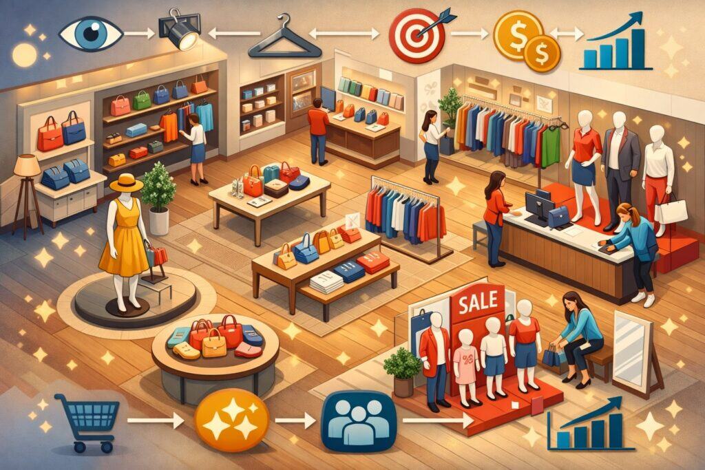
Conclusion
Visual merchandising is where brand, behavior, and buying decisions meet. The most effective visual merchandising tips for retailers aren’t about copying trends—they’re about building clarity, creating desire, and guiding momentum through the space.
When your store layout supports browsing, your displays tell simple stories, your lighting highlights what matters, and your signage removes confusion, shoppers feel confident. Confident shoppers buy more, return more often, and recommend you to others.
The long-term advantage comes from consistency and measurement. Treat visual merchandising like a system: strategy, execution, maintenance, and improvement. Refresh displays with a plan, train staff with clear standards, and track what changes behavior and increases sales.
As retail continues to blend physical and digital journeys, visual merchandising will keep evolving toward personalization, sustainability, and more interactive experiences. Retailers who invest in visual merchandising now—practically and consistently—will be in the strongest position to win attention, trust, and loyalty in the years ahead.